 Kyle Walker
You may not know your neighbors by name, but you can at least know them by education level.
Kyle Walker, an assistant professor of geography at Texas Christian University, has created an interactive dot map visualizing US neighborhoods by educational attainment.
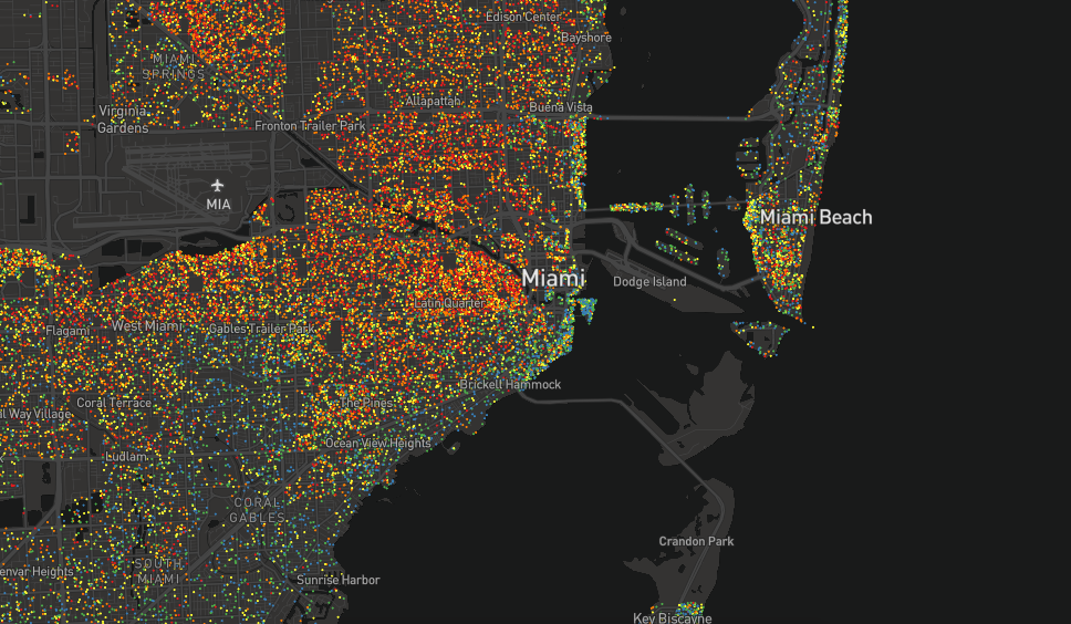
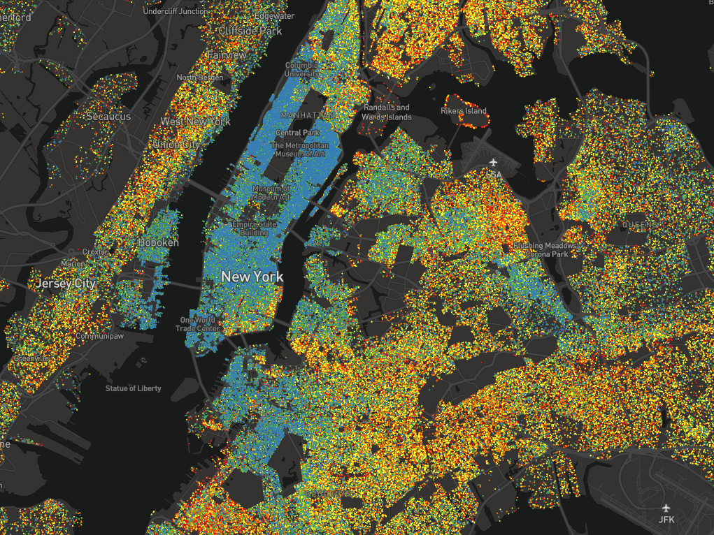
Each dot represents between 25-500 people over the age of 25, and each is color-coded based on how far those people have gone in school. Blue dots are graduate degrees, green are bachelor's, yellow are some college, orange are high school, and red is everything short of high school.
The map helps to solidify what are, for most people, likely abstract concepts. They confirm people with less education tend to live in the outer boroughs around Manhattan, for example, and that a single highway can separate rich and poor.
Here's how the maps shake out in various cities across the US.
The San Francisco Bay Area is marked by high levels of education in Berkeley gradually shifting to less education further south in Oakland. Across the Bay, San Francisco is made up largely of graduate degrees — except for a pocket of red in Chinatown.

New York City residents cluster blue in Manhattan and affluent parts of Brooklyn but get less educated deeper into the outer boroughs. On the island, blue dots begin to fade into green and yellow near 100th St., as it turns into Harlem.

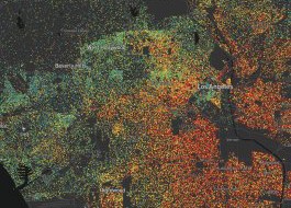
Walker's map reveals stark differences in Los Angeles, where Beverly Hills and West Hollywood are all green and blue, while downtown LA and east LA contain a heavy concentration of high school dropouts.

Chicago gets more educated the further you move toward Lake Michigan, with the greatest concentration of graduate-degree holders living in the South Loop neighborhood. Like LA, the city has clear divisions between neighborhoods.

As you might imagine, Boston proper and Cambridge have the most highly-educated people in the city, given they're home to Harvard, MIT, and other elite schools. Education levels fall as one goes further south.

Dallas itself is pretty segregated in terms of education levels, but the metropolitan area as a whole is fairly well mixed. Cities like Garland and Arlington don't trend heavily one direction or the other.

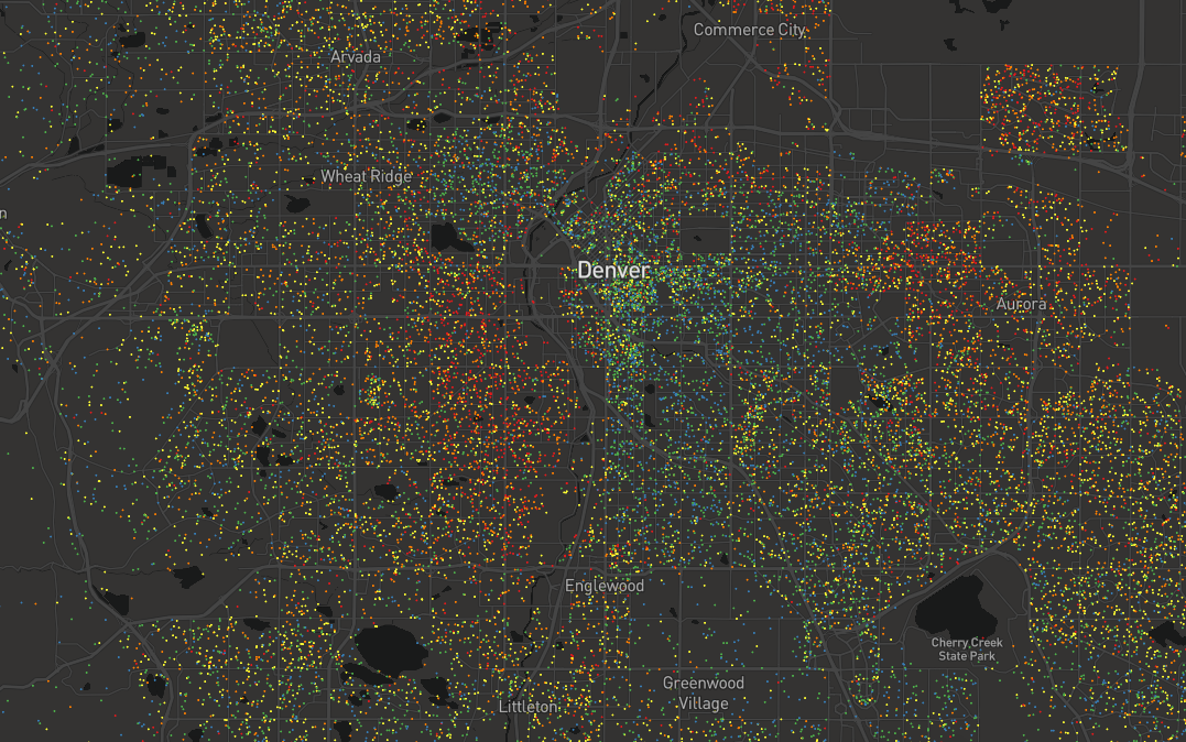
Denver contains primarily highly-educated residents, but levels change dramatically crossing over Interstate-25, as the number of high-school grads and dropouts increase.
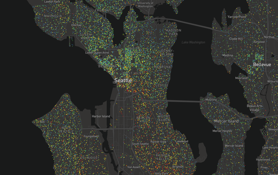
In its densest regions, Seattle is fairly well-integrated between the college grads and high school grads. It's only in the Chinatown regions to the south do red dots begin to cluster.
In northern Atlanta, a strip of less-educated residents cuts through a sea of blue and green dots. And while the city's highest-degree earners still live in the city center, they are far outnumbered by lower-earners to the south and east.

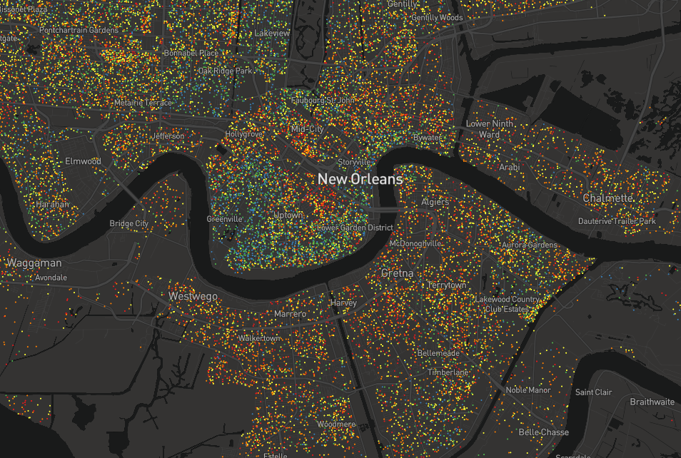
New Orleans' population generally becomes less educated the further inland you move from Lake Pontchartrain to the north and the final stretch of the Mississippi River to the south.
Aside from a blue sliver right on the coast, the bulk of Miami's population has attained some college at most or just a high-school diploma. Miami Beach is far more mixed, however.