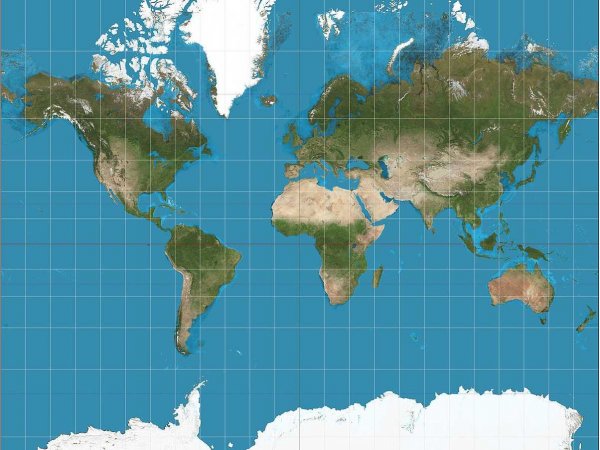
 The traditional Mercator projection Wikimedia Commons
Advertisements
The traditional Mercator projection Wikimedia Commons
Advertisements
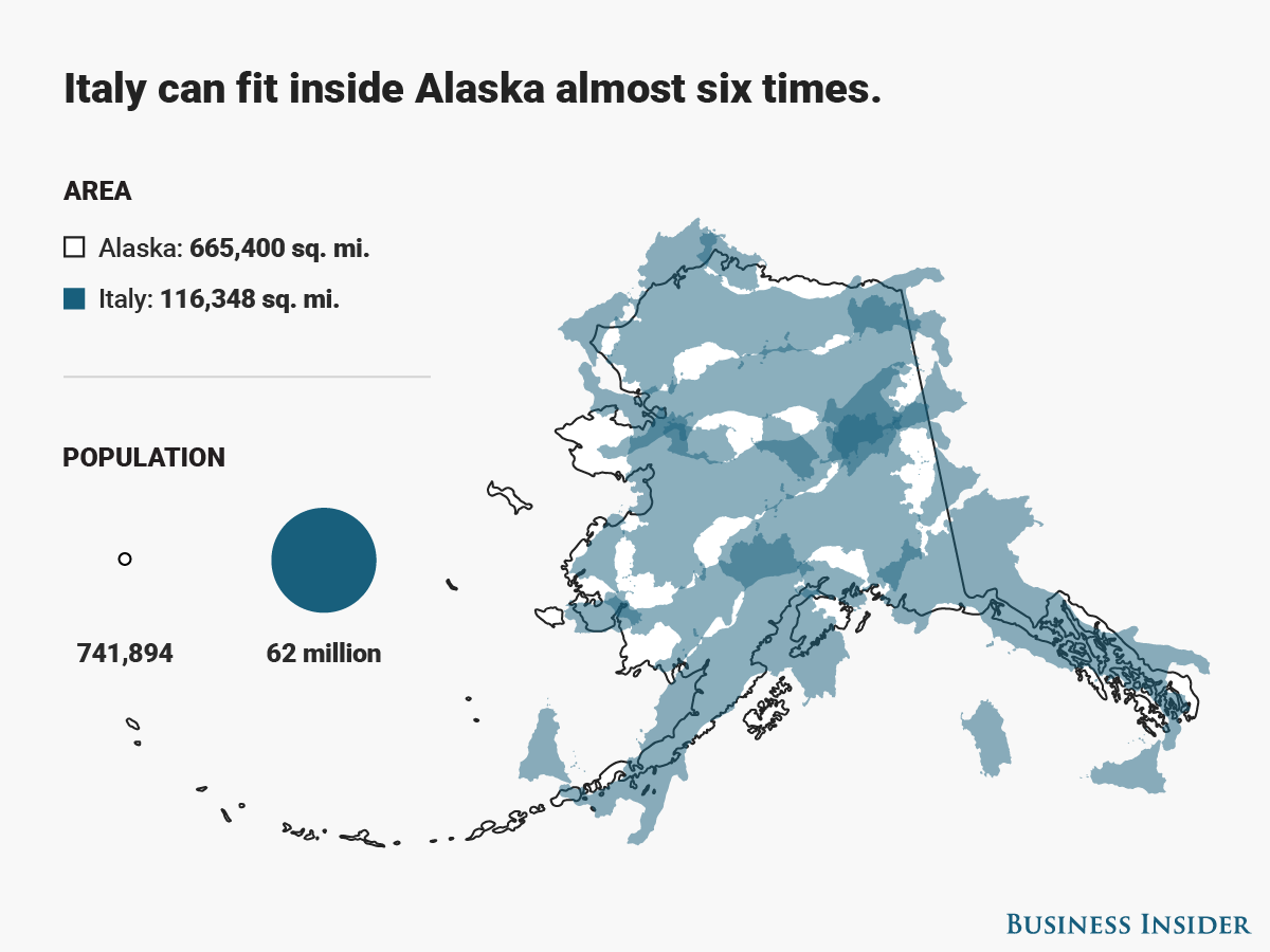
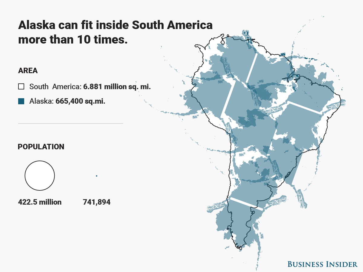
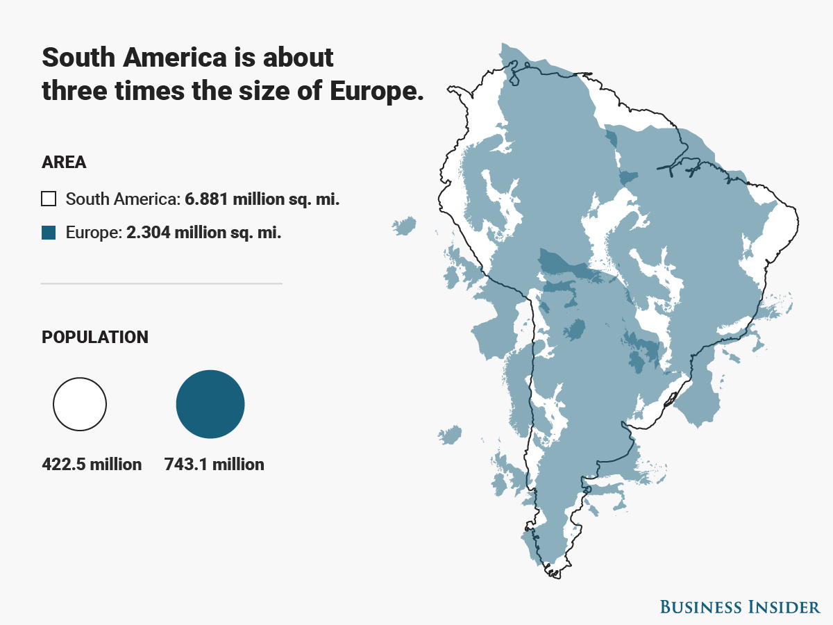
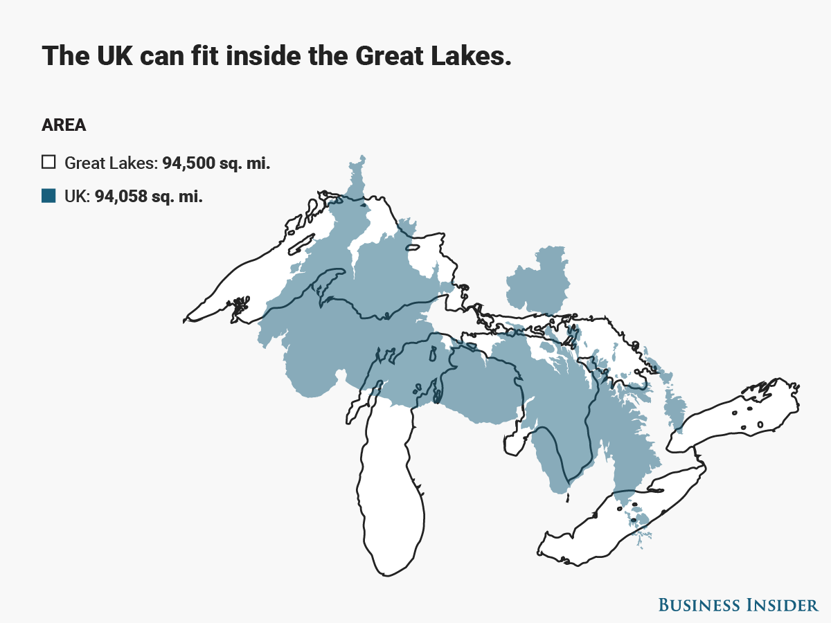
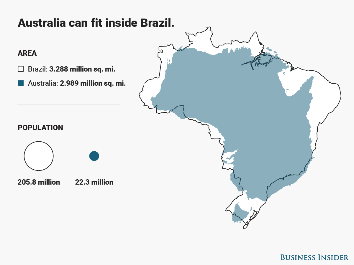
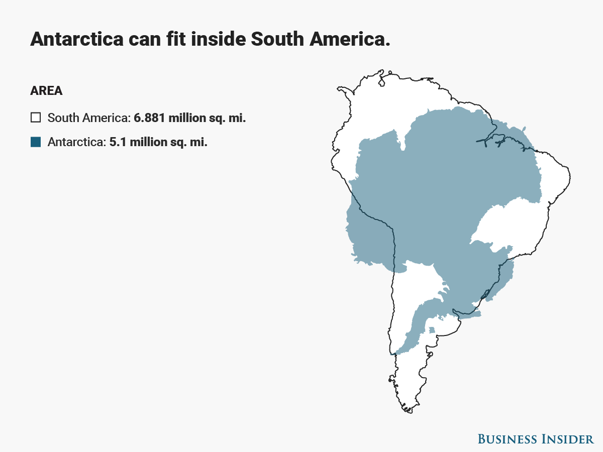
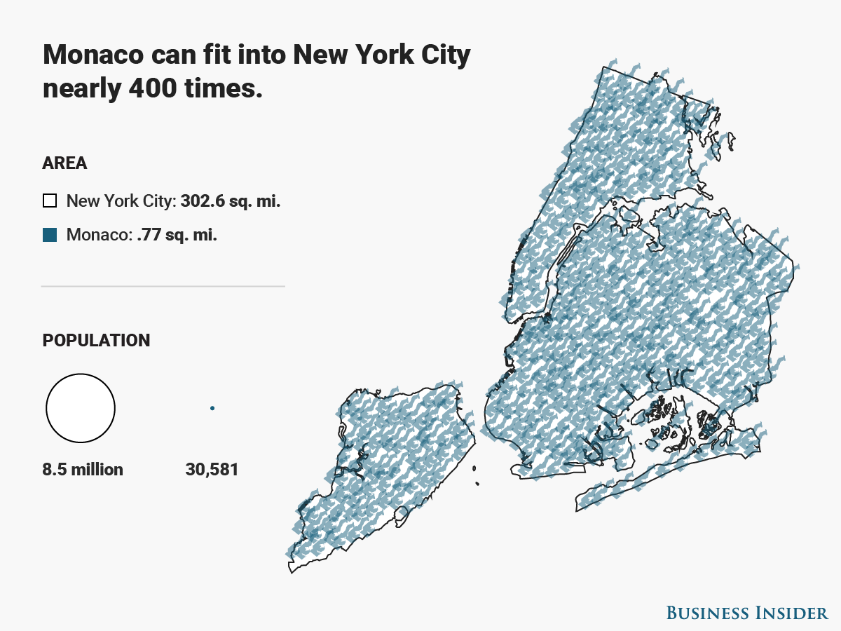
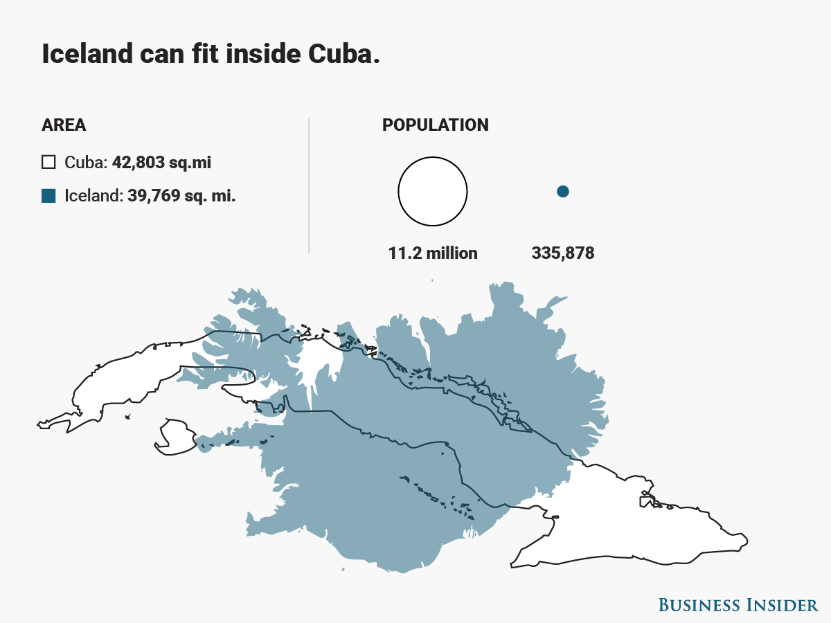
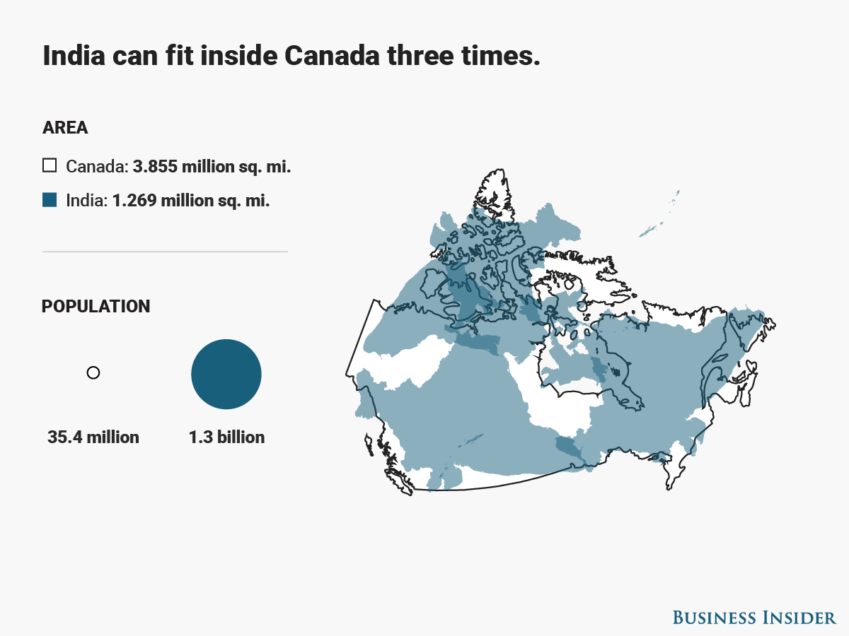
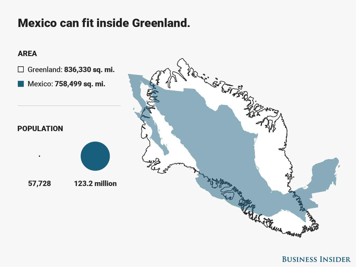
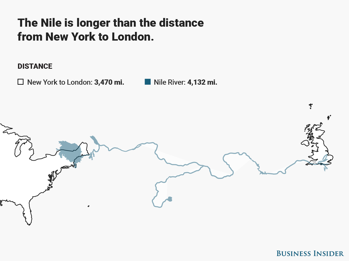
Maps are all imperfect because they portray the globe in just two dimensions. Most maps, like the Mercator projection, distort the size or shape of land masses, which skews our perceptions of how big continents and countries are compared to one another.
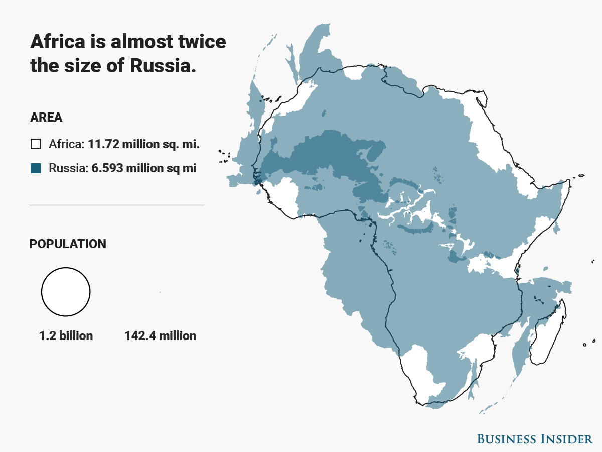
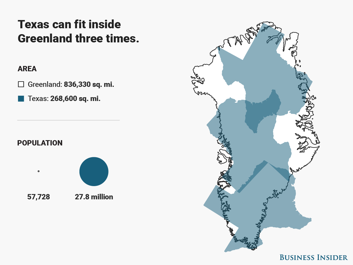
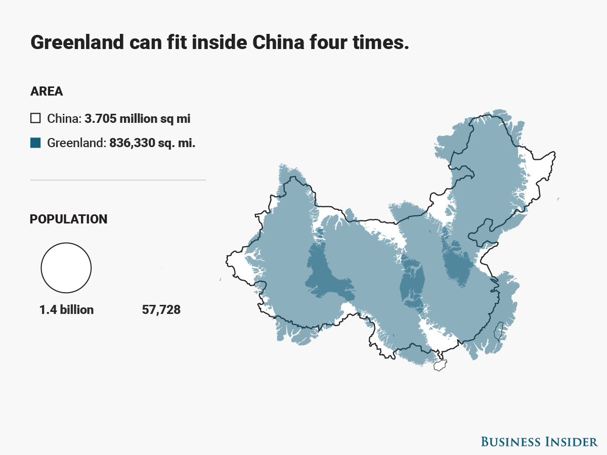
When you consider square mileage though, a whole new world appears. Inspired by this map of Africa's true size from German graphic designer Kai Krause, we created 15 map overlays to open your eyes to some real geography.

Advertisements
Advertisements
Christina Sterbenz contributed to this story.